The all-new 'Quentin Blake' font
Friday 4th March 2016
Monotype case study gives a behind-the-scenes look at the creation of a distinctive new typeface
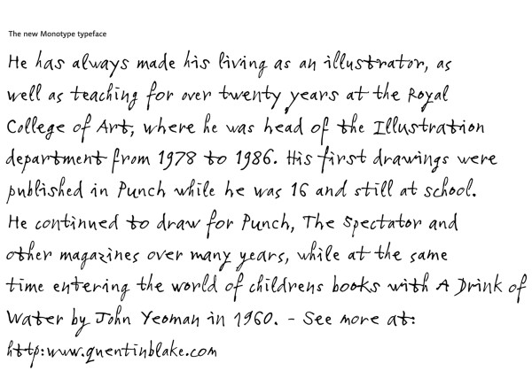
World-renowned font designers Monotype have produced a fantastic new typeface based on Quentin Blake's handwriting. As the case study on their website reveals, font designer Toshi Omagari brought some detailed techiques to bear to create a font that seeks to mirror the natural flow of Quentin's handwriting. Four variants of each letter shape were selected to provide the same rhythm and spacing as something he had written by hand.
“Without variants, handwriting fonts run the risk of looking unnatural; too many and the process can become unmanageable,” explains Toshi. “Quentin’s writing is anything but regular but it’s not totally random either. There’s something you can find in it to say that it’s his — just as no single cloud is identical to another and has no definite shape, when you find one in the sky you can still tell it’s a cloud.”
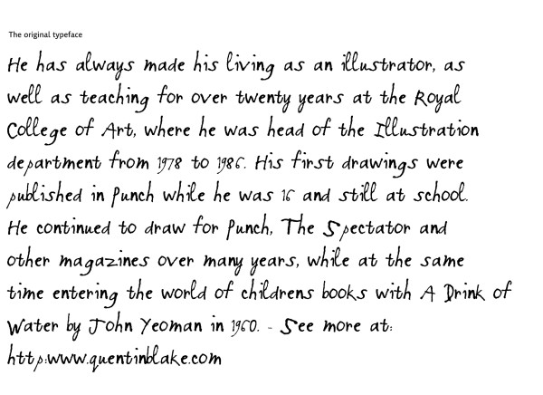
In today's environment of digital apps and publishing, the flexibity offered by having a font which would allow Quentin to choose whether he needs actually to write required text by hand or not would be invaluable. The difference between a non-variant version and the new Monotype set can been seen in a comparison with a much older font developed for publishing purposes over fifteen years ago.
The finished typeface doesn’t just look like handwriting, it acts like it too. As you type a letter, each one of the four variants appears in an order that avoids repetition of the same shape, making it appear random. For print use, a roughness filter has been applied to give an authentic handwritten finish, while the web version has a cleaner outline and smaller character set to achieve a reduced file size. A 'Display' version, using the same simplified set of characters as the web font, makes it suitable for a variety of uses at large scale, such as posters and signage.
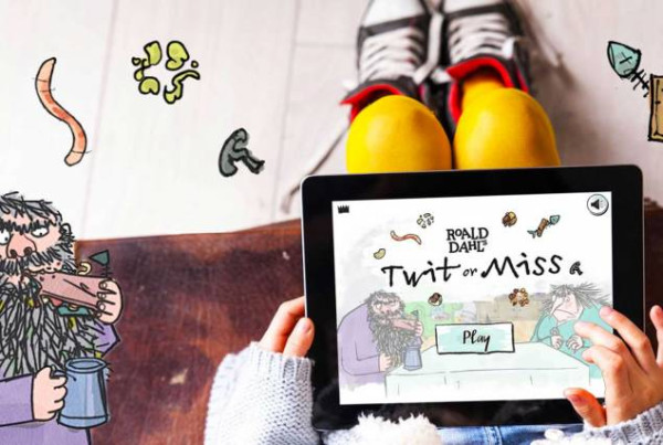
The 'Quentin Blake' font is already in use in several of Quentin's projects: on television programmes and digital apps (such as 'Roald Dahl's Twit or Miss') and will soon be appearing in many more diverse places, from traditional print, to merchandise and exhibition displays.
As Quentin commented: “I have been impressed by the way that Monotype interpreted my handwriting in various forms, so that it has the distinctive characteristics but at the same time is eminently usable as a typeface in any number of situations.”
The Quentin Blake font is intended for use in collaborative projects undertaken by Quentin Blake, and is not currently Licensed to the general public. For enquiries about licensing the font, please contact Quentin's agent Millie Hoskins, using our Contact Form


